

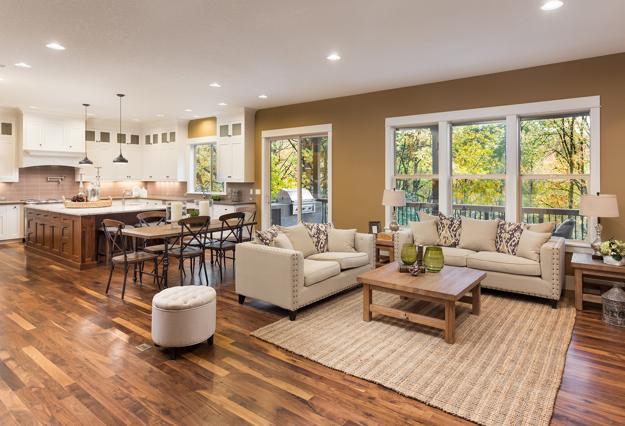
A floor can be technically beautiful and still look wrong in the room. This usually happens because of undertone. The tile, hardwood, cabinets, wall paint, trim, and natural light may all be pulling in slightly different color directions.
Undertone is not just a design word. It is one of the main reasons a floor sample that looked perfect in a showroom can feel too pink, too yellow, too gray, too green, or too orange once installed at home.
What undertone means in flooring
Undertone is the color temperature sitting underneath the main color. A beige tile may have pink, yellow, gray, or green undertones. A brown hardwood floor may lean red, gold, neutral, or ashy. These subtle shifts become much stronger when installed across hundreds of square feet.
The problem is scale. A small sample may seem neutral in your hand, but a full floor reflects light into the room and interacts with every fixed finish. That is why Perennial Studios encourages homeowners to test samples in the actual space before making a final decision.
Why cabinets and walls can make floors look wrong
Cabinets are one of the biggest undertone traps. A warm maple cabinet can make a cool gray floor look flat or blue. A white cabinet with a creamy undertone can make a stark white tile look harsh. A red-toned wood cabinet can fight with brown hardwood that has a different red base.
Wall color matters too. A greige wall, beige wall, or warm white wall can change how flooring reads throughout the day. In Texas homes with strong natural light, floors may look warmer in the afternoon and cooler in shaded rooms. Testing only under showroom lights is not enough.
How to test tile and hardwood samples properly
Samples should be placed flat on the floor, not held upright like paint swatches. Floors reflect light differently when horizontal. A hardwood plank or tile sample should be viewed in morning light, afternoon light, evening light, and with interior lights on.
It also helps to place samples next to fixed materials. Put them beside cabinets, fireplace stone, trim, stair parts, countertops, and large furniture pieces. If the floor only looks good when isolated, it may not be the right choice for the whole space.
The safest undertone strategy for open floor plans
Open floor plans need extra care because the flooring may touch several design zones at once. One floor might run past a kitchen island, living room rug, dining set, hallway trim, and fireplace. The undertone has to cooperate with all of them.
The safest choice is usually not the blandest choice. It is the floor with the most compatible undertone. A warm neutral hardwood, a soft limestone-look porcelain, or a balanced taupe tile can feel more expensive than a dramatic floor that clashes with permanent finishes.
Before choosing flooring, test undertone in the actual home, against the actual materials, in the actual light. This step can prevent expensive regret and help the final installation feel intentional, calm, and connected to the rest of the space.
For tile and hardwood flooring guidance in Arlington, TX, visit Perennial Studios at Arlington, TX. We proudly serve
Arlington, TX, Mansfield, TX, Burleson, TX, Kennedale, TX, or Midlothian, TX
with flooring sales, design consultation, and professional installation. If you want help choosing flooring that works with your cabinets, walls, and light, contact us today.


