

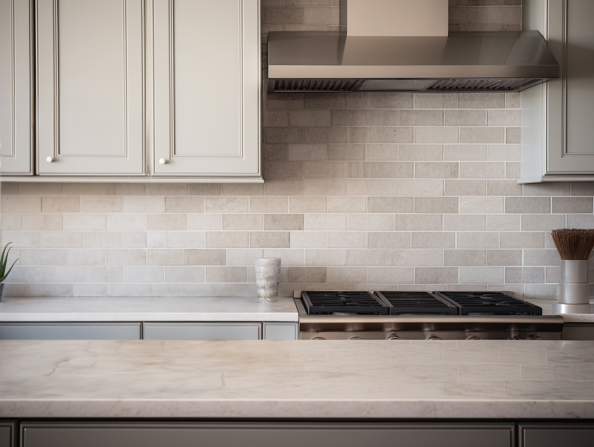
A kitchen can be beautiful and still feel visually noisy. High-contrast tile, busy veining, sharp grout lines, and competing finishes can make even a well-designed space feel crowded. That is one reason tone-on-tone kitchens are gaining attention. They create visual continuity, soften transitions, and make a room feel calmer without stripping away character.
For homeowners in Arlington, tone-on-tone tile is not just a design trend. It is a practical way to make kitchens feel larger, cleaner, and easier to live with.
What tone on tone actually means
Tone on tone does not mean everything matches exactly. It means the key surfaces sit within a close value range, so your eye reads the room as one cohesive composition instead of a set of competing parts.
In kitchen tile, that can mean:
Floor tile close in tone to cabinets
Backsplash tile that supports the countertop instead of fighting it
Grout selected to reduce visual grid lines
Warm neutrals layered instead of stark contrasts
The result is a quieter room with more visual flow.
Why high contrast can feel cluttered
Contrast has a place, but too much of it can create constant interruption.
Common culprits include:
Bright white grout against dark tile
Strongly patterned tile paired with dramatic counters
Cool gray flooring under warm cabinetry
Multiple statement surfaces in one sightline
When every finish asks for attention, the kitchen feels busier than it is. Tone-on-tone design reduces that friction.
Where tile matters most in a calmer kitchen
The floor
Flooring covers the largest visual area in the kitchen. When the floor is heavily contrasted or overly busy, it anchors the room in the wrong way. A softer, matte tile in a compatible tone usually makes the entire space feel more settled.
The backsplash
Backsplashes sit at eye level, so pattern and joint lines read strongly. A tone-on-tone backsplash still adds texture, but it does so without shouting over cabinets, hardware, or counters.
The grout
Grout is one of the most underestimated design choices in a kitchen. A coordinated grout color reduces the checkerboard effect and helps the tile read as a surface rather than a grid.
Technical choices that keep the look polished
Matte or low-sheen finish
Lower sheen helps the surface feel grounded and forgiving. It also hides smudges and water marks better than a polished finish in busy kitchens.
Controlled variation
A little variation gives tile depth. Too much variation can break the tone-on-tone effect. Look for tile with moderate movement, not chaotic contrast.
Right-size joint spacing
Narrow, appropriate grout joints reduce visual interruption. Tile edge type matters here. Rectified tile can allow a cleaner, more refined look when the substrate is properly prepared.
Warm undertone matching
Beige is not just beige. Taupe, sand, greige, cream, and mushroom all behave differently under light. Matching undertones between floor tile, backsplash tile, and cabinetry is what makes the palette feel intentional.
Is tone on tone too safe
Not if it is done well. A calm palette still allows depth through:
Texture
Scale
Light variation
Mixed finishes
Natural-looking movement
A kitchen does not need high contrast to feel sophisticated. In fact, many of the most timeless kitchens rely on restraint, not drama.
Best fit for real-life homes
Tone-on-tone tile works especially well when homeowners want:
A kitchen that feels calmer
Better visual flow into adjacent rooms
A less cluttered background for open shelving
Surfaces that age well
A finish palette that will not date quickly
It is also useful in smaller kitchens where heavy contrast can chop up the room visually.
Tone-on-tone kitchen tile is not about playing it safe. It is about controlling visual noise so the kitchen feels clean, cohesive, and easier to enjoy every day. The best versions use careful undertone matching, grout discipline, and surface texture to create interest without clutter.
MB Carpet & Flooring helps Arlington homeowners choose tile that works both technically and aesthetically. Visit our showroom in Arlington, TX to compare kitchen tile options, coordinate finishes, and plan installation with confidence. We serve Arlington and nearby DFW areas with flooring, tile, design consultation, and professional installation support. Contact us to start your kitchen flooring or tile project with a practical, well-designed plan.


